
Free talks and guides by Martin Osner
Composition in Photography, Beyond the Rules
Your photographs may be sharp, well composed and beautifully exposed, and still nobody stops to look. The rules of composition will give you a correct photograph. They will not, on their own, give you one that people remember.
In three free talks, fine art photographer Martin Osner goes past the rule of thirds into what the rules leave out: how the human eye actually sees, what camera angle, format and the lens do to the viewer, and why good photographs so often look predictable. Each talk has a free guide to download and keep.

Part 1 · 41 minutes
Part 1, The Part Nobody Teaches
Most photographers who have been at it a while share the same frustration. They understand light, they know their camera, they apply the rules of composition faithfully, and yet their portfolio holds a handful of strong pictures and a great deal of filler. Part 1 explains why, starting with how human beings actually see.

Watch Part 1 on YouTube 41 minutes
What Part 1 covers
- Superman Syndrome. We believe we see the whole scene sharply. We do not. The eye works with a tiny spotlight of sharp focus, called foveal vision, and your composition has to guide where that spotlight lands.
- Visual indigestion. Trying to tell the whole story in one frame. A strong photograph starts the story and lets the viewer finish it.
- The full orchestra. The rules are one instrument. Format, visual communication, visual design and the psychology of colour are the others.
- Rules or guidelines. Why the rules are a foundation, not the destination, and why you learn them before you break them.
Stop trying to tell the whole story. Start the story, and respect your viewer enough to let their imagination complete it.— Martin Osner
Free guide, Part 1
The Part Nobody Teaches
The written companion to Part 1, a PDF to keep beside you and come back to. Inside:
- How foveal vision and the way the eye scans decide what your viewer sees
- Why cluttered frames lose people, and how simplicity and mystery hold them
- What horizontal, vertical, panoramic and square formats say before any rule applies
- Visual design and the psychology of colour as tools, not afterthoughts
- Ten principles to carry into your own photography
Free, sent to your inbox. You will be taken to artphotographyacademy.com
Part 2 · 37 minutes
Part 2, How to Make People React to Your Photographs
Same woman, same clothing, same light. Photographed at eye level she looks approachable. From a low angle, looking away, she looks like a leader. From a low angle, looking into the lens, she looks powerful. Nothing about her changed. Only the camera did.
Part 2 is about the decisions you make before you press the shutter, built around three questions: what do I want to say, what do I want my viewer to experience, and will it come across without me there to explain it?

Watch Part 2 on YouTube 37 minutes
Five tools, decided before you lift the camera
- Camera angle. Eye level is how everyone sees the world all day. Go low for power, high for empathy.
- Proximity. The larger your subject in the frame, the more authority you give it.
- Format. Horizontal reads as calm, vertical as strength.
- Distortion. A wide angle lens close up makes the nearest part bigger, on purpose.
- Compression. A telephoto lens pulls the background in, simplifies it and separates your subject.

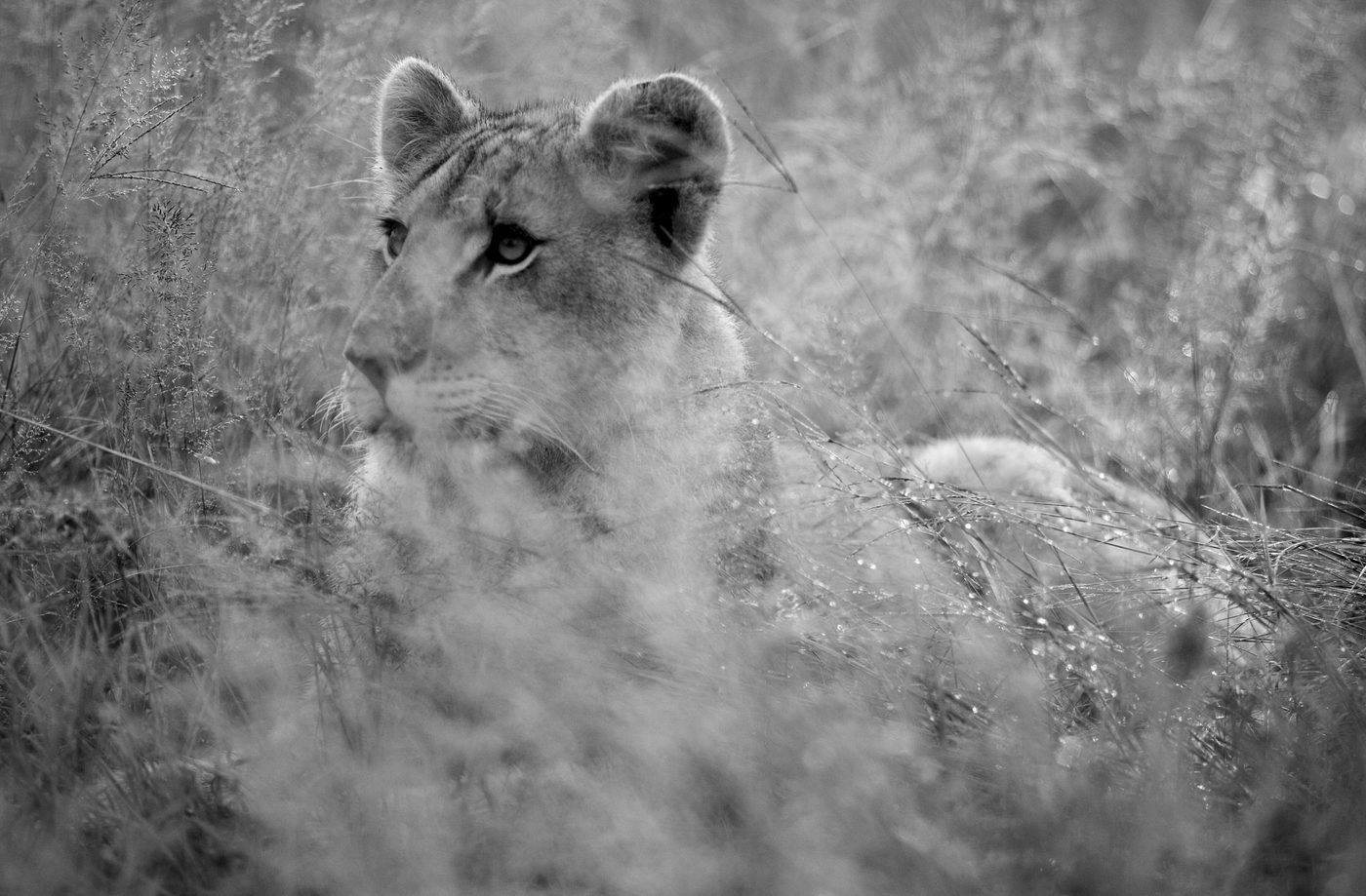
Free guide, Part 2
How to Make People React to Your Photographs
The written companion to Part 2, a PDF to keep beside you and come back to. Inside:
- The three questions behind every photograph that speaks
- Camera angle, with the same portrait made three ways
- Format, proximity, distortion and compression, each with examples
- Why the tripod should come last, and where to learn from films
- An exercise to take camera angle to the extremes
Free, sent to your inbox. You will be taken to artphotographyacademy.com
Part 3 · 51 minutes
Part 3, Why Good Photographs Look Predictable
A curator once turned down a friend of Martin's with one word: his work felt very calendar like. Beautiful, pretty, and predictable. That one word changed his photography so completely that the gallery now represents his work. Part 3 is about that word, and the difference between a photograph that is correct and one that is yours.

Watch Part 3 on YouTube 51 minutes
Three reasons good photographers fall into the calendar trap
- Emotion is a magnificent liar. Your memory of being there makes a predictable picture feel extraordinary, to you alone.
- The rules give you correct, not memorable. Technically correct is the minimum standard, never the destination.
- We photograph the subject, not our response to it. The result is a trophy, not a photograph with your fingerprint on it.
Four ways out
- Give it a world. Show where your subject lives, not only what it looks like.
- Make it your way. A format, a light or a process nobody else at the same spot would repeat.
- Earn the right to move back. Start close, step back slowly, and add only what the picture needs.
- Leave it unfinished. Start the story and let the viewer finish it.
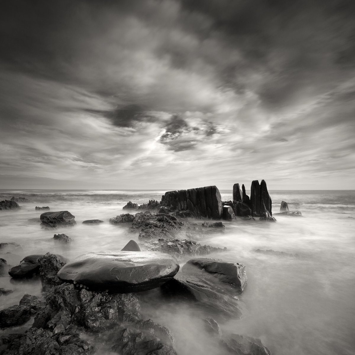

Free guide, Part 3
Why Good Photographs Look Predictable
The written companion to Part 3, a PDF to keep beside you and come back to. Inside:
- The three reasons good photographers fall into the calendar trap
- How to find out honestly whether your best work is any good
- Four ways out, from two photographers who did it, Koos van der Lende and Klaus Tiedge
- An exercise to try this week
Free, sent to your inbox. You will be taken to artphotographyacademy.com
The usual rules
The rules of composition, and where they stop helping
The rules are worth knowing. They have been passed down through centuries of painting and used in photography since the early 1900s. Here are the ones you will meet most often.
- Rule of thirdsPlace the subject on a third of the frame, not the centre.
- Leading linesRoads, rivers and fences that carry the eye into the picture.
- Symmetry and balanceMirror the two halves, or balance a large shape against a small one.
- FramingA doorway or branches around the subject to hold the eye.
- Negative spaceEmpty space that gives the subject room to breathe.
- Golden ratioA spiral or grid used for centuries in painting.
Martin prefers to call them guidelines. A guideline respects your judgement; a rule demands obedience. Followed on their own they give you a photograph very few can fault, and very few will remember. What they do not tell you is what you want to say, what you want the viewer to feel, and how to make the picture yours. That is what the three talks are about.
Are you a rule follower, or are you a visual composer?— Martin Osner
Questions
Questions about composition in photography
What is composition in photography?
Composition in photography is how you arrange everything inside the frame: where the subject sits, what you include and what you leave out, the angle and distance you work from, the format, the lines, shapes, light and colour. Good composition decides where the viewer looks first and what they feel. It is a decision you make, not an accident.
What are the rules of composition in photography?
The best known are the rule of thirds, leading lines, symmetry, framing, negative space, the rule of odds and the golden ratio. They have been tested over centuries of visual art and they work as a foundation. Martin Osner calls them guidelines rather than rules, because they give you a correct photograph, not necessarily a memorable one.
Should you break the rules of composition?
Learn them first, then depart from them with intent. Breaking a rule at random only produces confusion. Breaking it because you know what you want the viewer to feel is where fine art photography begins.
How does camera angle change a photograph?
From a low angle, looking up, your subject gains power and authority. From a high angle, looking down, it loses power and the viewer begins to feel empathy. Eye level is how everyone sees the world all day long, so use it only when you have a reason. Part 2 of the series shows the same woman, in the same light, photographed three ways.
Why do my photographs look boring when the composition is right?
Usually because the photograph shows the subject but not your response to it. The rules give you correct, not memorable, and your own memory of being there makes a predictable picture feel special to you alone. Part 3 explains the three reasons and four ways out.
Is there a free composition in photography guide in PDF?
Yes, one for each of the three talks. Each guide is the written companion to its talk, with the pictures and an exercise. They are free and sent to your inbox.
Learn composition properly
Two courses that teach composition in full
YouTube can only open the door. Subjects like these need a classroom: time, practice and feedback on your own photographs.
Rules of Composition: The Part Nobody Teaches
An online course at the Art Photography Academy. Composition, camera format, visual communication, visual design and the psychology of colour, in three detailed modules.
See the Rules of Composition courseYou will be taken to artphotographyacademy.com
Advanced Photography Course
Six weeks, a step up from the fundamentals. Week five is composition, week six is visual communication, with a practical exercise after every lesson and feedback in your class group.
See the Advanced Photography Course